

Ojai Coffee Roasters
Roasted With Love Since 1995.
Ojai Coffee Roasters is a neighborhood favorite that’s been serving the Ojai community for 30 years. When Stacey first reached out, the project began with a few promotional stickers— but it quickly grew into a long-term creative partnership that continues to evolve.
Now approaching its 30th anniversary, the café continues to evolve, and our collaboration has grown alongside it. Together, we've created everything from menus and mailer boxes to signage and storefront graphics, all while honoring the shop’s original charm.
Logo design by Han Greene
Brand Identity Expansion / Menu + Print Collateral Design / Print Production Liaison Services
@ojaicoffeeroasters
www.ojaicoffeeroasters.com

When DIY Charm Needed Direction
Stacey had a logo and a handful of legacy graphics, but no formal brand system. As new shops opened around town with slick branding, Ojai Coffee's visuals started to feel patchworked and inconsistent. She wanted to preserve its friendly, local feel without getting left behind.

From DIY To Art Directed
Stacey had a logo and a handful of legacy graphics, but no formal brand system. As new shops opened around town with slick branding, Ojai Coffee's visuals started to feel patchworked and inconsistent. She wanted to preserve its friendly, local feel without getting left behind.
Strategic Expansion
Rather than overhaul what was already working, we focused on evolution, not reinvention. I expanded on her existing assets with a flexible visual system that could be rolled out gradually and affordably.
I also helped Stacey:
Prioritize which design elements to update first
Identify trusted local and online print vendors for menus, signage, and stickers
Create templates for internal reuse to keep things moving without starting from scratch
Maintain consistency across all new materials, from product packaging to in-store signage

A Vibe That Brews Belonging
Stacey and I refreshed her existing branding with:
A warm, earthy color palette that nods to Ojai’s landscape
Typography that blends vintage utility with friendly modernity
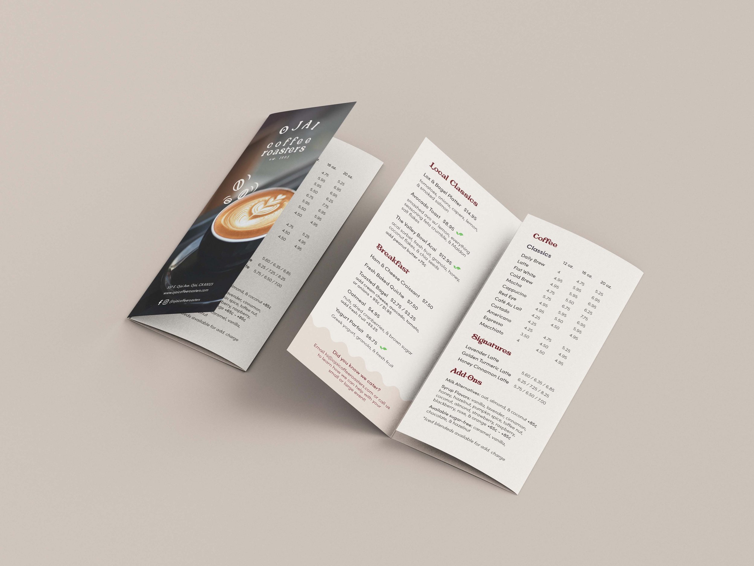
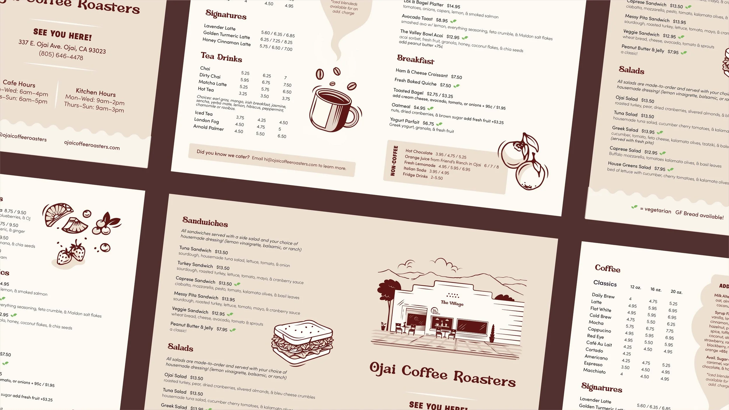
Modular signage and menu designs
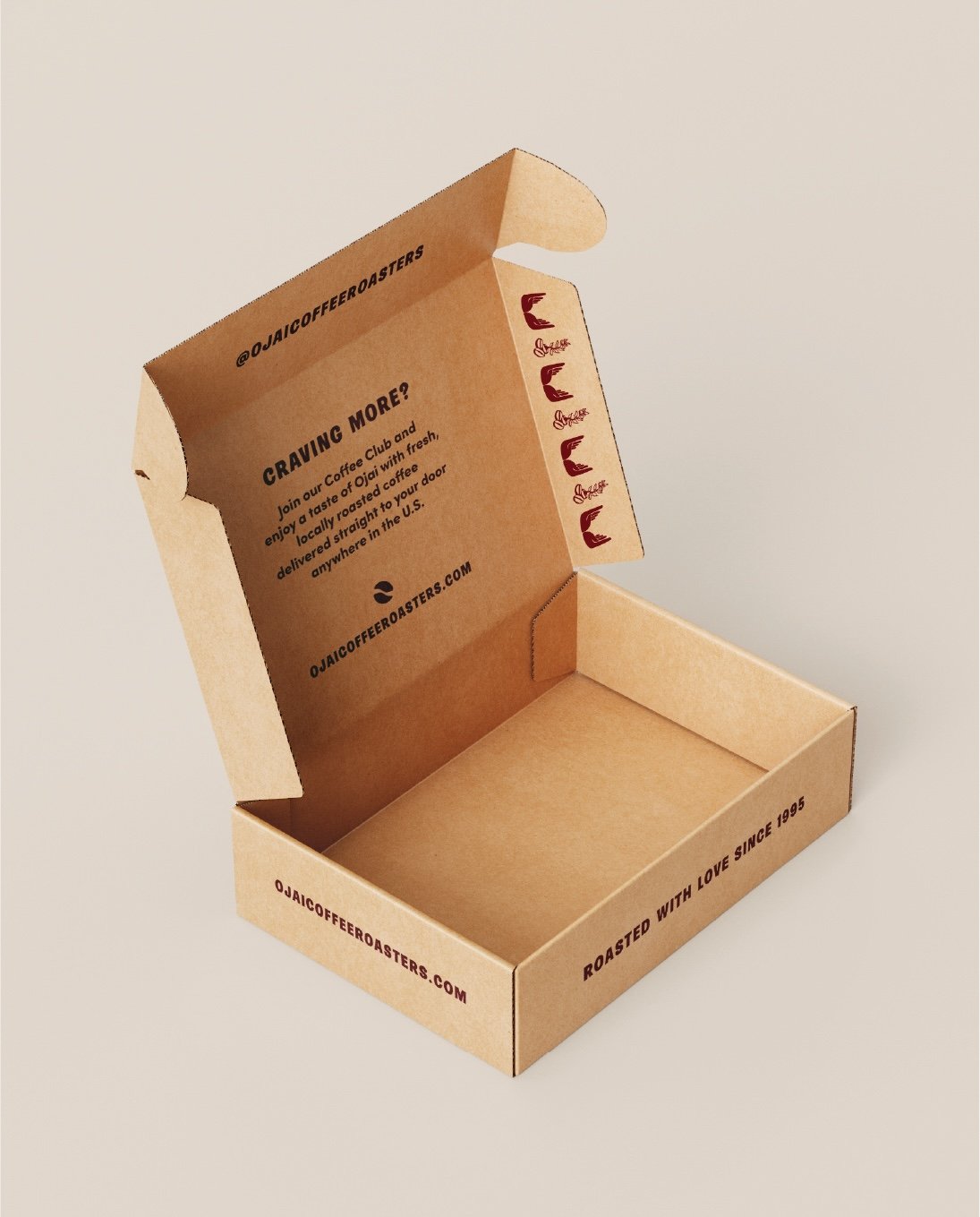
Custom icons and graphic flourishes for stickers, bags, boxes, and more
This gentle rebrand gave Ojai Coffee Roasters the polish it needed without losing what made it handmade and special.
A Vibe That Brews Belonging
Stacey and I refreshed her existing branding with:
A warm, earthy color palette that nods to Ojai’s landscape
Typography that blends vintage utility with friendly modernity
Modular signage and menu designs
Custom icons and graphic flourishes for stickers, bags, boxes, and more
This gentle rebrand gave Ojai Coffee Roasters the polish it needed without losing what made it handmade and special.

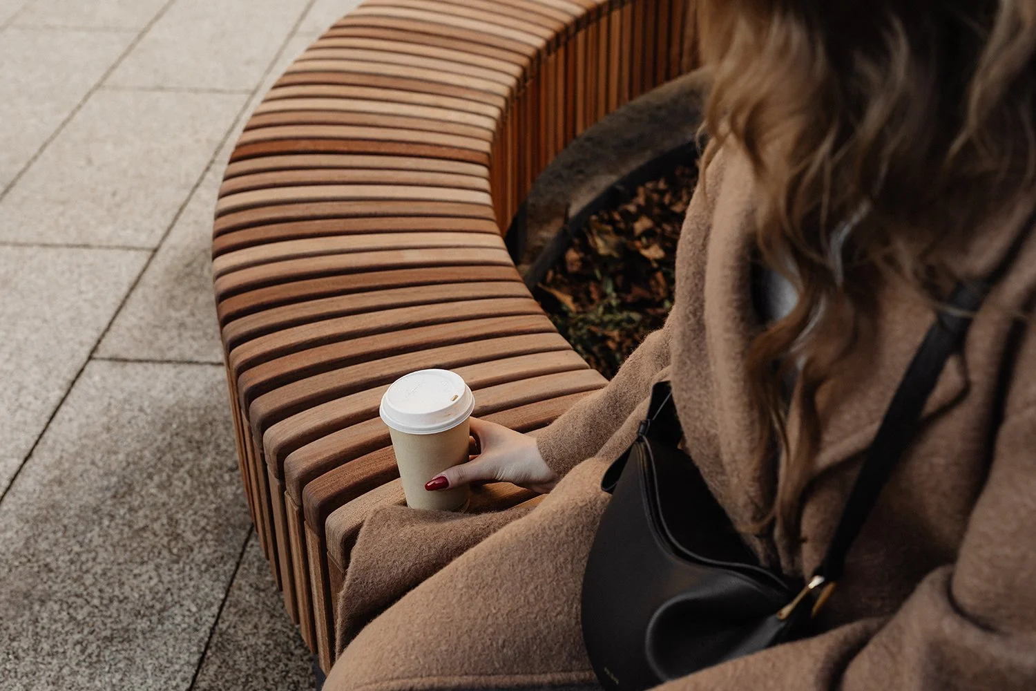
Local Love, Amplified
The feedback has been overwhelmingly positive. Locals instantly recognized the refreshed vibe, and Stacey shared that customers regularly comment on the new menus, sticker designs, and coffee boxes.
As a result, Ojai Coffee Roasters is better positioned for its next chapter: more foot traffic, more event bookings, and a clearer brand identity that aligns with both longtime patrons and new visitors.