

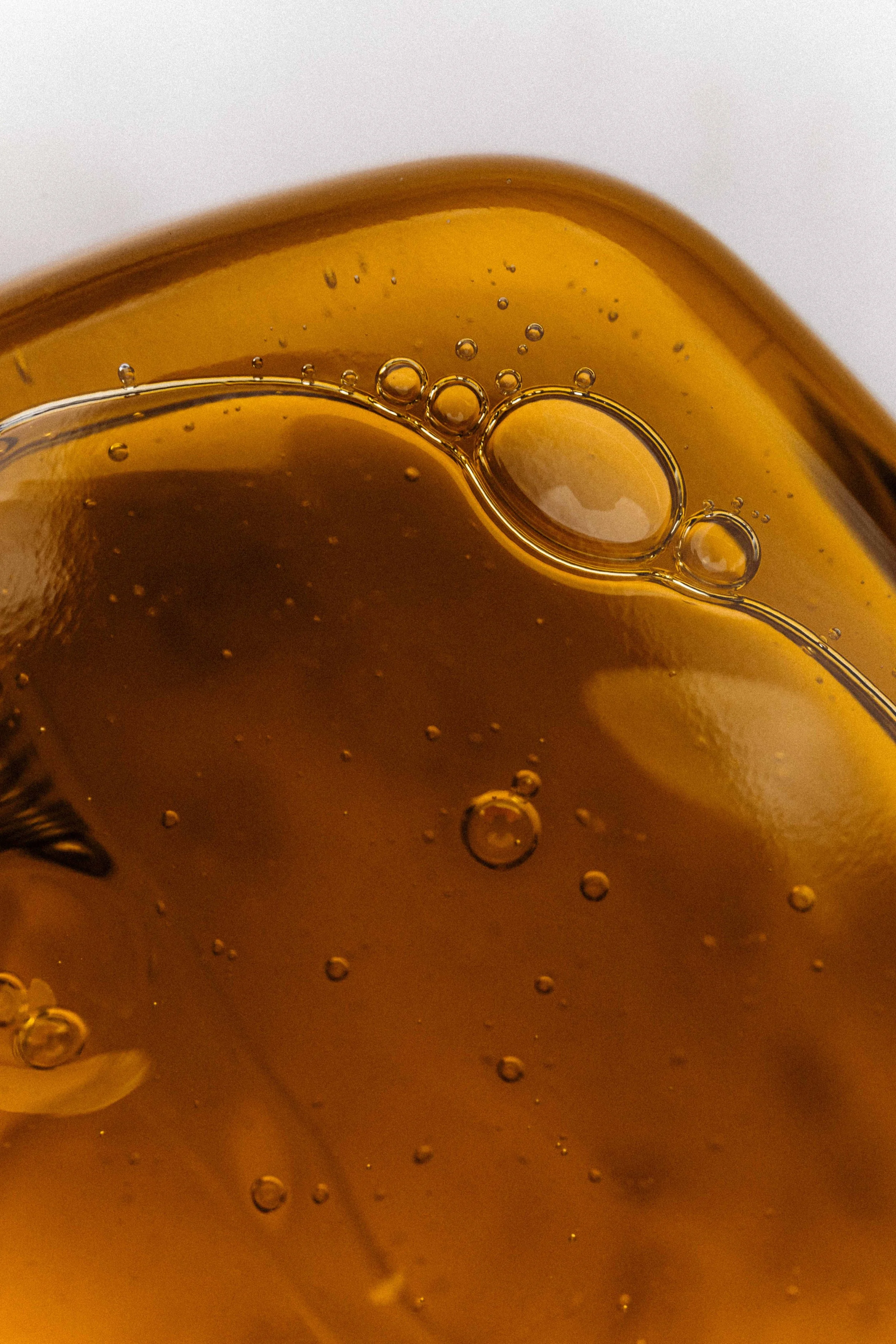
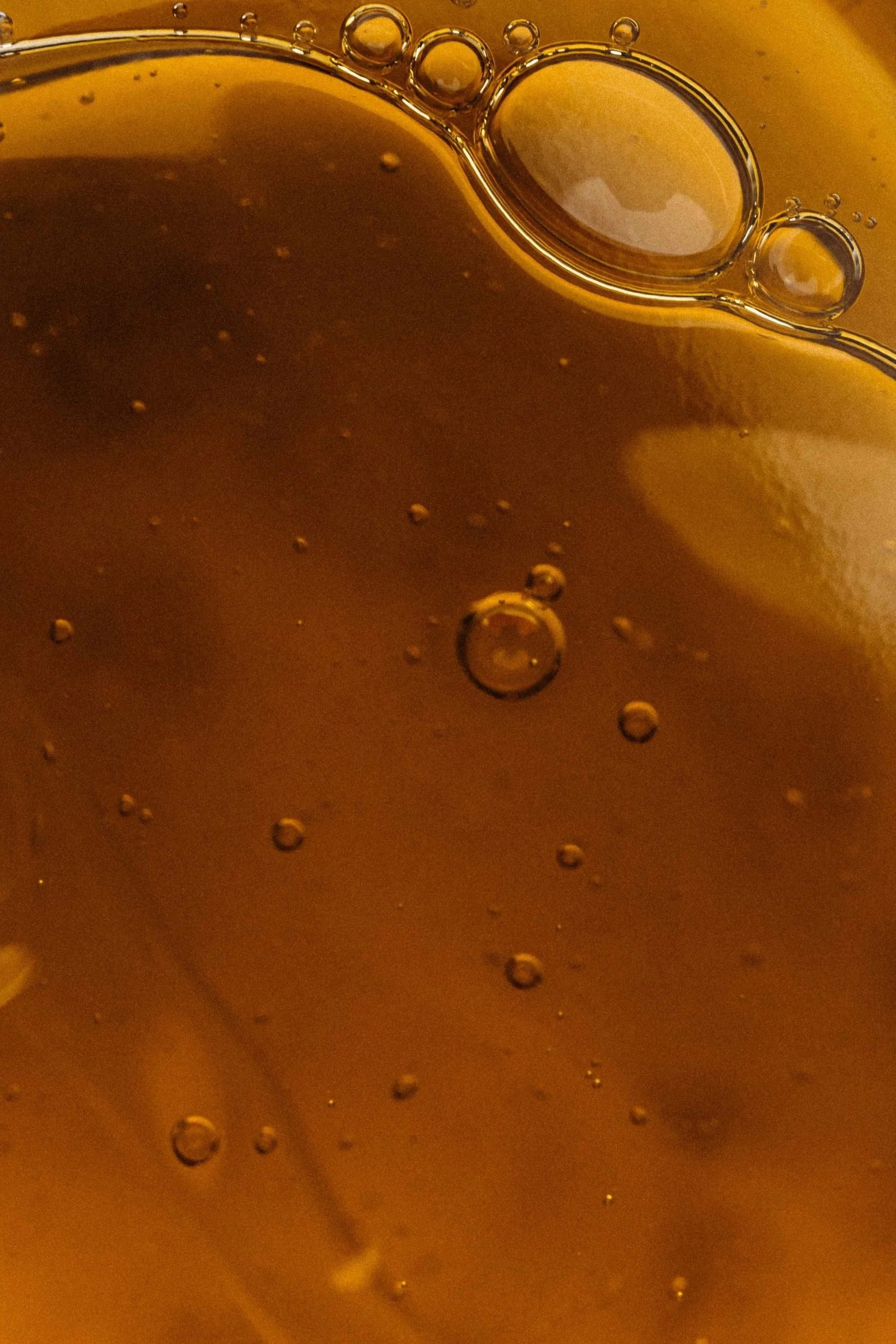
GARA Skincare
Plant-powered formulas to revitalize your skin.
When Emilee reached out, GARA Skincare was already well-respected in the CBD skincare space. But the visuals hadn’t evolved alongside her vision for the brand. She was moving toward an energetics-driven, herbally inspired direction and needed a softer, more fluid identity to reflect that shift.
Visual Audit / Logo Redesign / Packaging Design / Brand Identity Refresh / Production Consulting / Print Collateral + Partnership Deck Design
@gara_skincare
www.garaskincare.com


Original Logo + Packaging
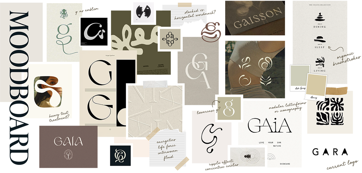
From Stiff to Soft
Emilee’s original logo had a blocky, Dr. Bronner’s–inspired aesthetic. It didn’t align with her new focus on plant medicine, subtle energies, and approachable wellness. The packaging looked utilitarian, and the brand lacked a visual system that felt soulful or inviting.

From Stiff to Soft
Emilee’s original logo had a blocky, Dr. Bronner’s–inspired aesthetic. It didn’t align with her new focus on plant medicine, subtle energies, and approachable wellness. The packaging looked utilitarian, and the brand lacked a visual system that felt soulful or inviting.
Original Logo + Packaging


Previous Logo
Refreshed Logo
Previous Logo
Refreshed Logo
Amplifying Flow
Rather than redesigning something flashy, we opted to strip back. We created a new logo that’s softer, more organic, and fluid. Letterforms breathe and ebb like herbal infusions. Labels and packaging were systematized to work affordably with Emilee and her partner’s in‑house printing setup, using accessible materials and finishes.
We curated an identity system that is:
Clean, minimal, and inviting
Repeatable and affordable for in‑house print runs
Flexible enough for future expansions into facial oils, hydrosols, workshops, or gift sets
Packaging now flows with GARA’s plant and energetics narrative, feeling calm, grounded, and intentional—just like the formulations themselves.
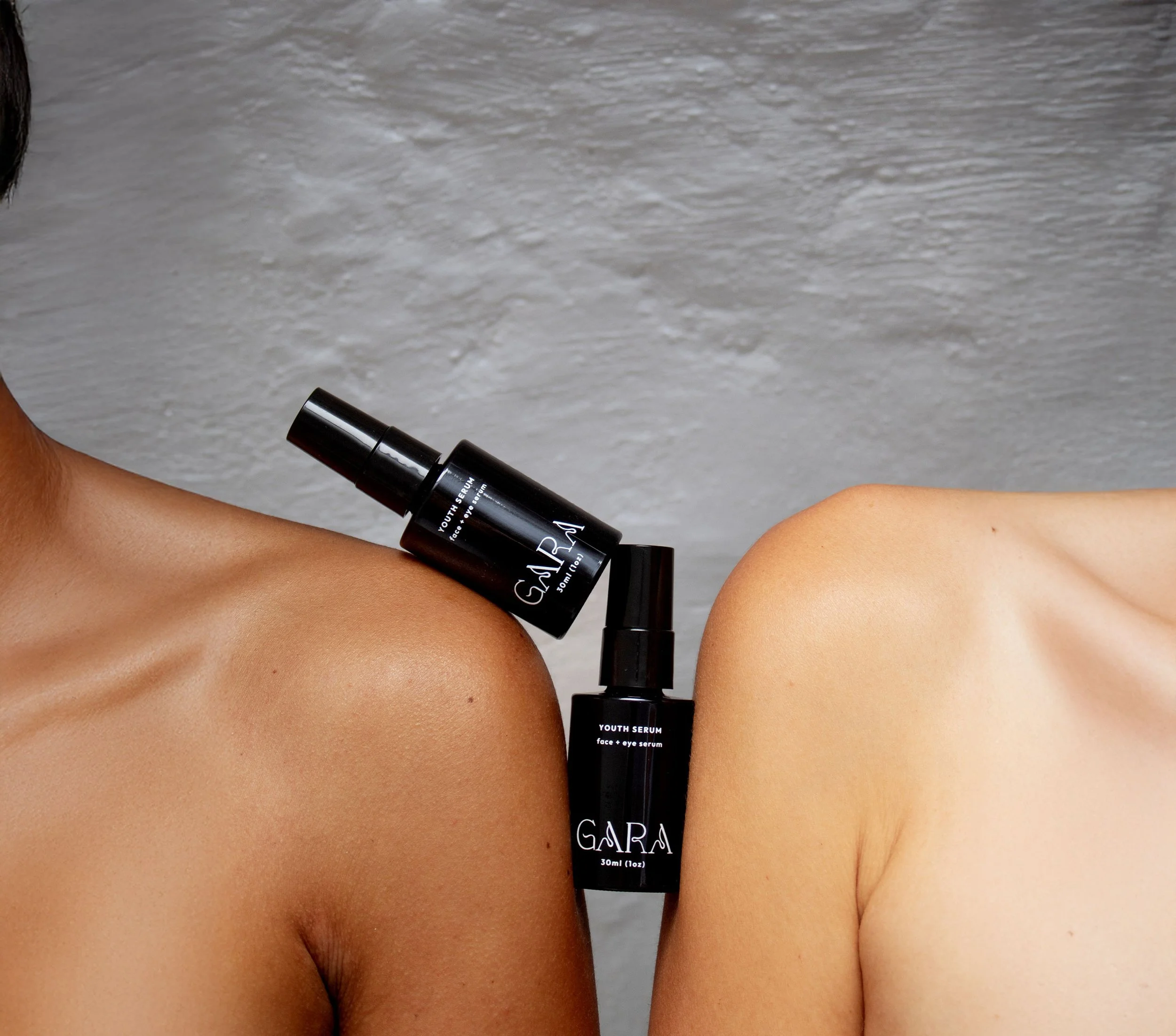

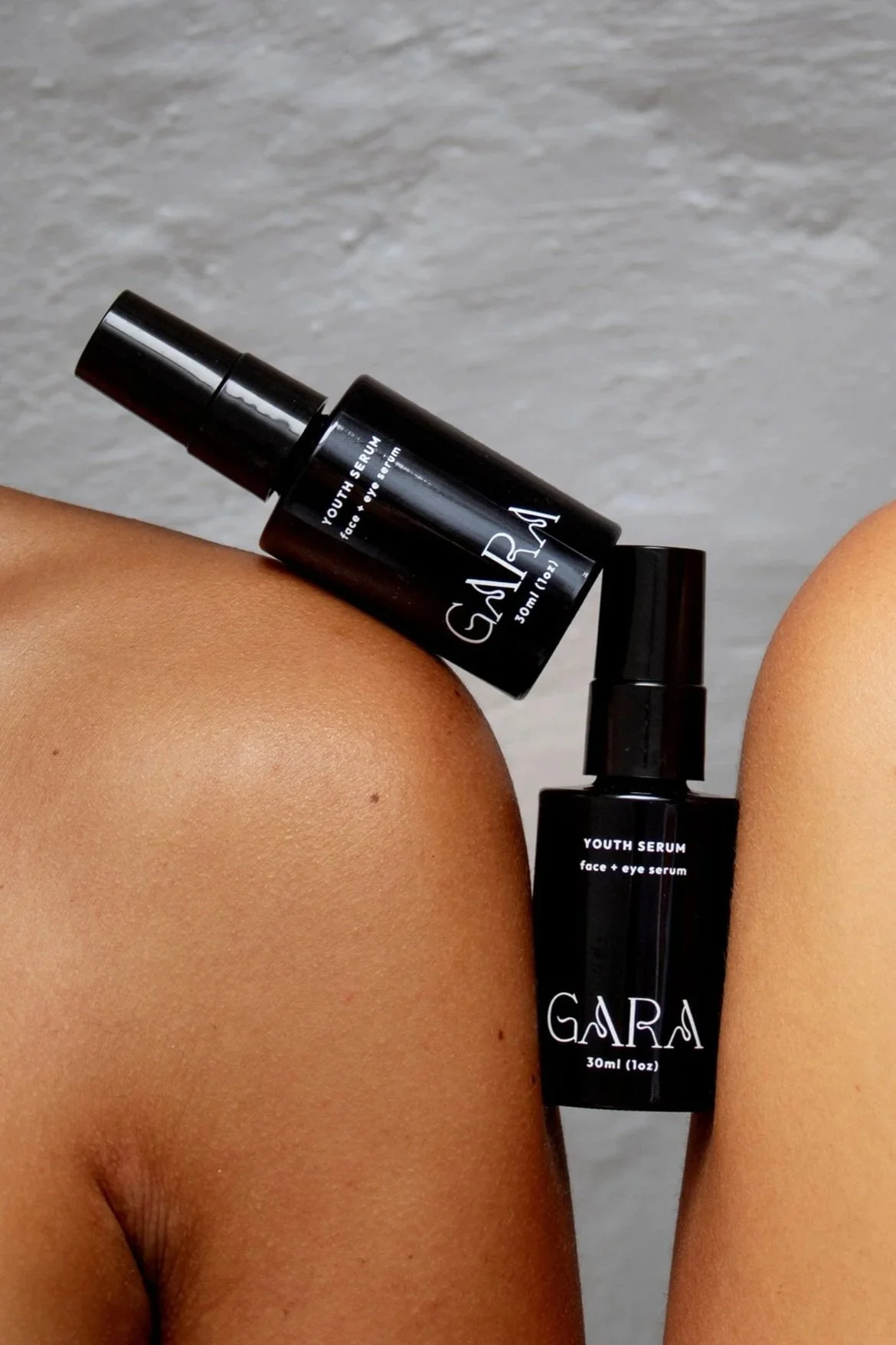
The Collection
GARA Skincare’s product line features a cohesive packaging system designed to reflect its herbally inspired, energetics-driven identity.
The Collection
GARA Skincare’s product line features a cohesive packaging system designed to reflect its herbally inspired, energetics-driven identity.

Purpose‑Driven Packaging Strategy
While keeping cost-efficiency in mind, we elevated the sensory and storytelling aspects:
Soft type hierarchy paired with botanical accent marks
Earthy neutrals and herbal greens that evoke root, leaf, and bloom
Consistent placement of product name, ingredient focus, and herb-forward descriptors—ensuring readability and brand cohesion
Packaging is not just a vessel anymore; it’s a quiet handshake of grounded beauty and energetic intent.

Renewed & Retail-Ready
Beyond the aesthetic shift, Emilee now feels proud of her brand. GARA’s new identity positions the brand for upcoming retail partnerships with apothecaries, wellness boutiques, and curated plant shops.
With this refresh, the path is open for GARA Skincare’s next phase of growth beyond DIY print runs and toward broader recognition, prestige partnerships and boutique shelves.
