

Maternally Nourished
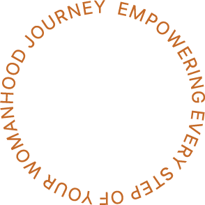
Empowering every woman’s motherhood journey.
Courtney Smith knew she wanted to support other moms in their journey, helping them nourish both themselves and their little ones. But her logo? It wasn’t telling that story.
She described it as “cookie cutter” and “generic,” something that could belong to any wellness coach. That didn’t sit right with me.
Logo Redesign / Brand Identity Design / Squarespace Landing Page Design
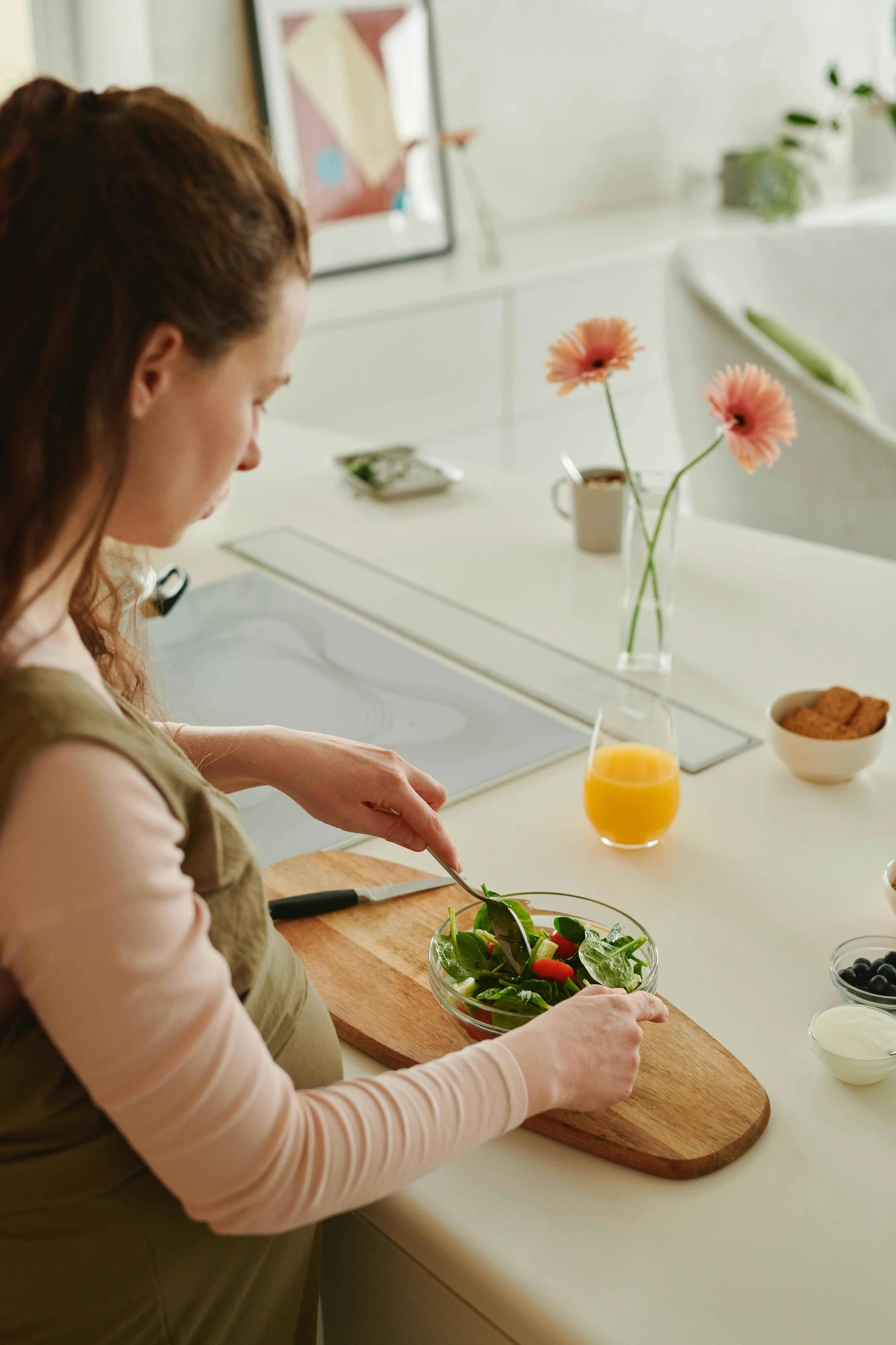
Photography by Christin Joy Jorgensen
@maternallynourished
www.maternallynourished.com
Maternally Nourished
Empowering every woman’s motherhood journey.
Courtney Smith knew she wanted to support other moms in their journey, helping them nourish both themselves and their little ones. But her logo? It wasn’t telling that story.
She described it as “cookie cutter” and “generic,” something that could belong to any wellness coach. That didn’t sit right with me.
Logo Redesign / Brand Identity Design / Squarespace Landing Page Design
Photography by Christin Joy Jorgensen
@maternallynourished
www.maternallynourished.com

The Backstory
Courtney, a powerhouse perinatal dietitian and wellness coach, came to me with a story that was deeply rooted in purpose and heart. Her passion for empowering moms through holistic health wasn’t just a career path— it was a calling shaped by her own upbringing. Raised by a resilient, single mom, she saw firsthand the strength, sacrifice, and unwavering love that motherhood requires. An origin story this meaningful deserved visuals that fully encapsulated its depth and beauty.

The Approach
Courtney and I began by digging deep to uncover what truly sets her apart.
While chatting with her over several calls, I tuned in to her rare balance of fearlessness, empathy, boldness, and poise. Courtney saw herself as a gentle guide for new moms navigating nourishment with a mix of science and soul. Her branding needed to embody that same energy— something nurturing yet powerful, gentle but grounded.
Enter the moodboard: warm, earthy tones that exuded care, paired with elements of quiet resilience and, dare I say, a bit of kick-***ery. (Is that a word? Well, it is now.)
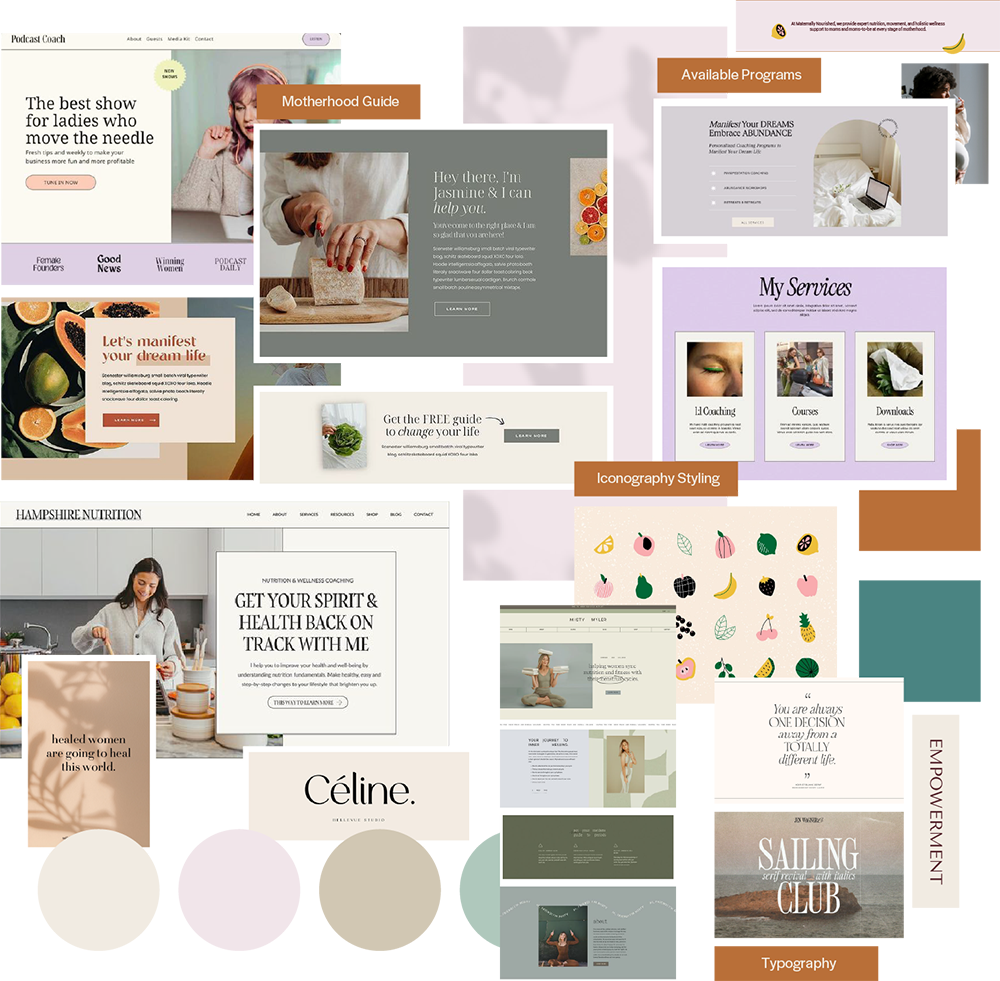

The Elements
This collaboration was about so much more than design. It was about helping Courtney see her own magic reflected back at her through a brand identity that finally felt authentic.
-
The new primary logo balances softness and strength, reflecting Maternally Nourished’s focus on holistic wellness for mothers. The typography and mark were refined to feel warm, modern, and grounded while standing apart from competitors in the maternal health space.
-
The updated brand identity includes a cohesive color palette, type system, and supporting graphics that create a more elevated, unified look. The visual system was designed to adapt seamlessly across social media, print materials, and digital touchpoints while maintaining a consistent, nurturing feel.
-
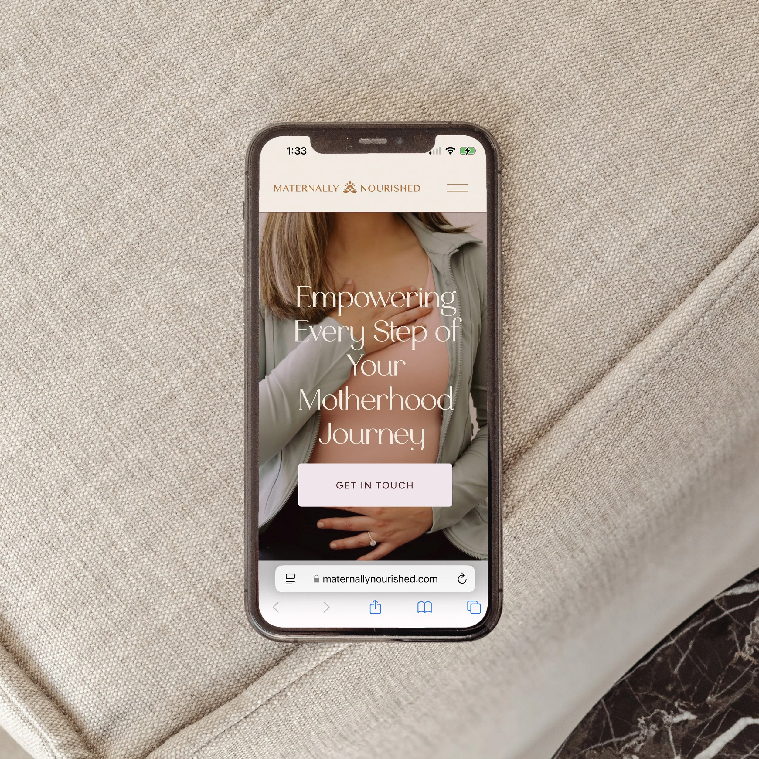
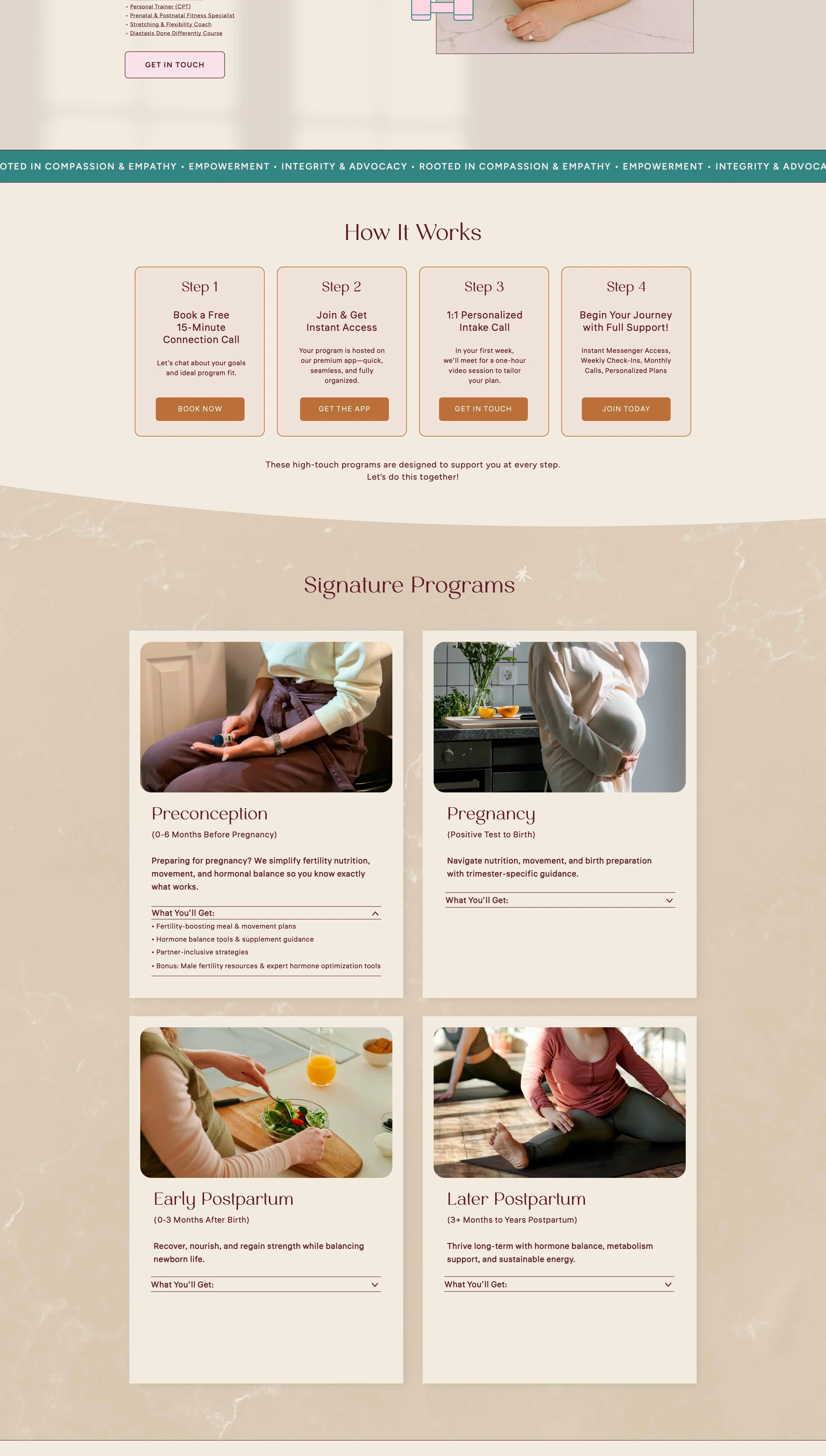
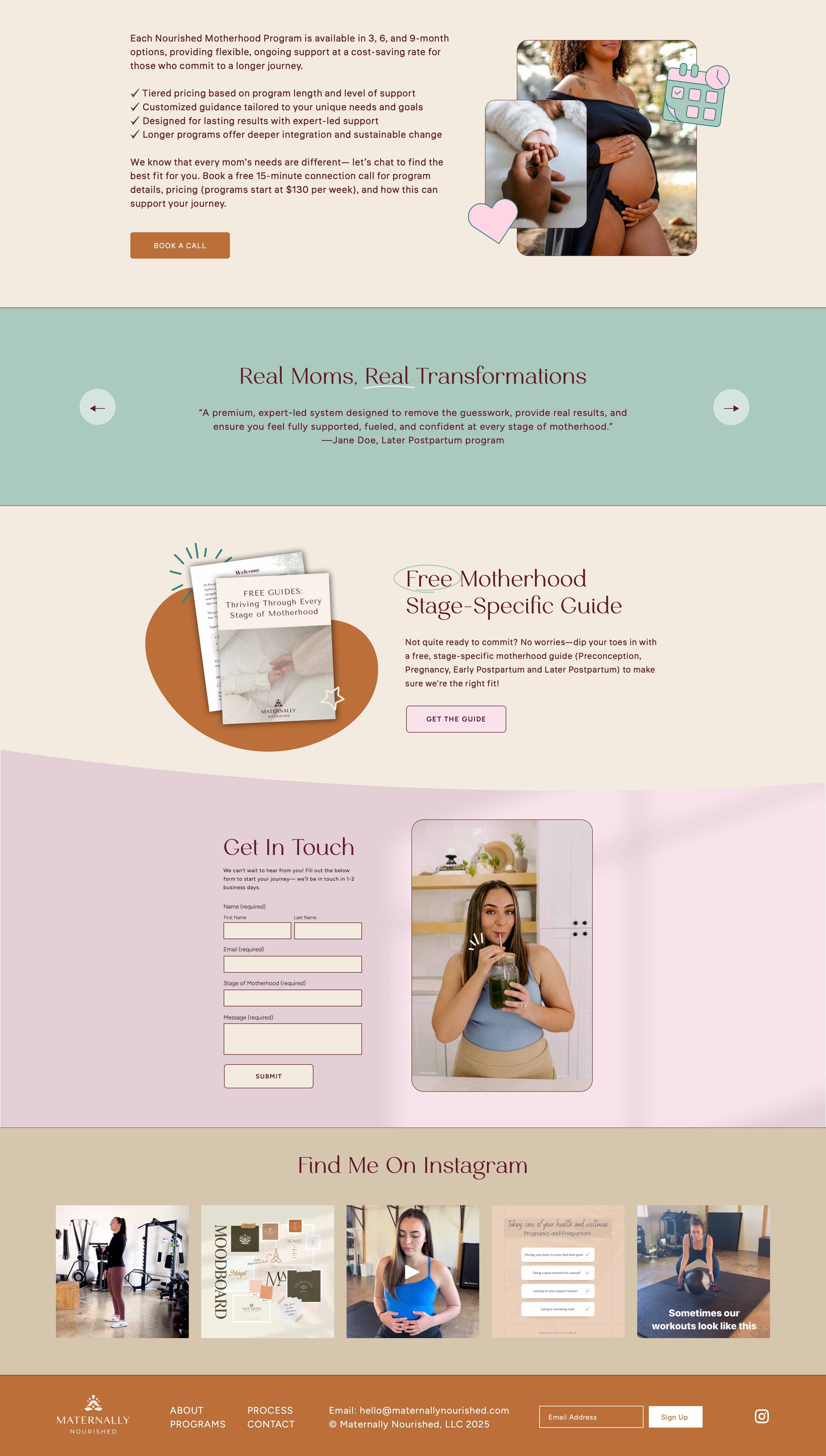
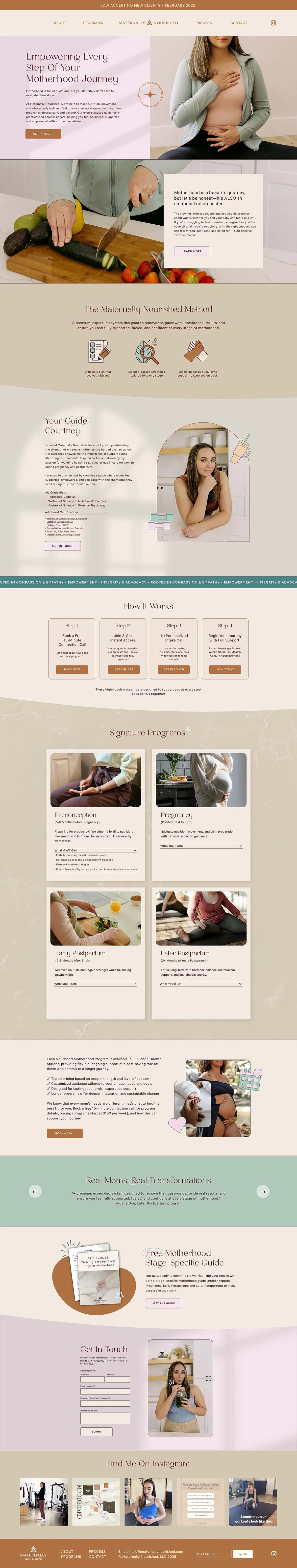
The landing page features a clean, conversion-focused design that clearly communicates Maternally Nourished’s services and philosophy. The refreshed visuals are paired with thoughtful layouts, compelling copy structure, and clear calls-to-action to guide visitors through the brand story.
The Elements
This collaboration was about so much more than design. It was about helping Courtney see her own magic reflected back at her through a brand identity that finally felt authentic.
-
The new primary logo balances softness and strength, reflecting Maternally Nourished’s focus on holistic wellness for mothers. The typography and mark were refined to feel warm, modern, and grounded while standing apart from competitors in the maternal health space.
-
The updated brand identity includes a cohesive color palette, type system, and supporting graphics that create a more elevated, unified look. The visual system was designed to adapt seamlessly across social media, print materials, and digital touchpoints while maintaining a consistent, nurturing feel.
-
The landing page features a clean, conversion-focused design that clearly communicates Maternally Nourished’s services and philosophy. The refreshed visuals are paired with thoughtful layouts, compelling copy structure, and clear calls-to-action to guide visitors through the brand story.
The Transformation
Previous Logo
Refreshed Logo
The Transformation
Previous Logo
Refreshed Logo
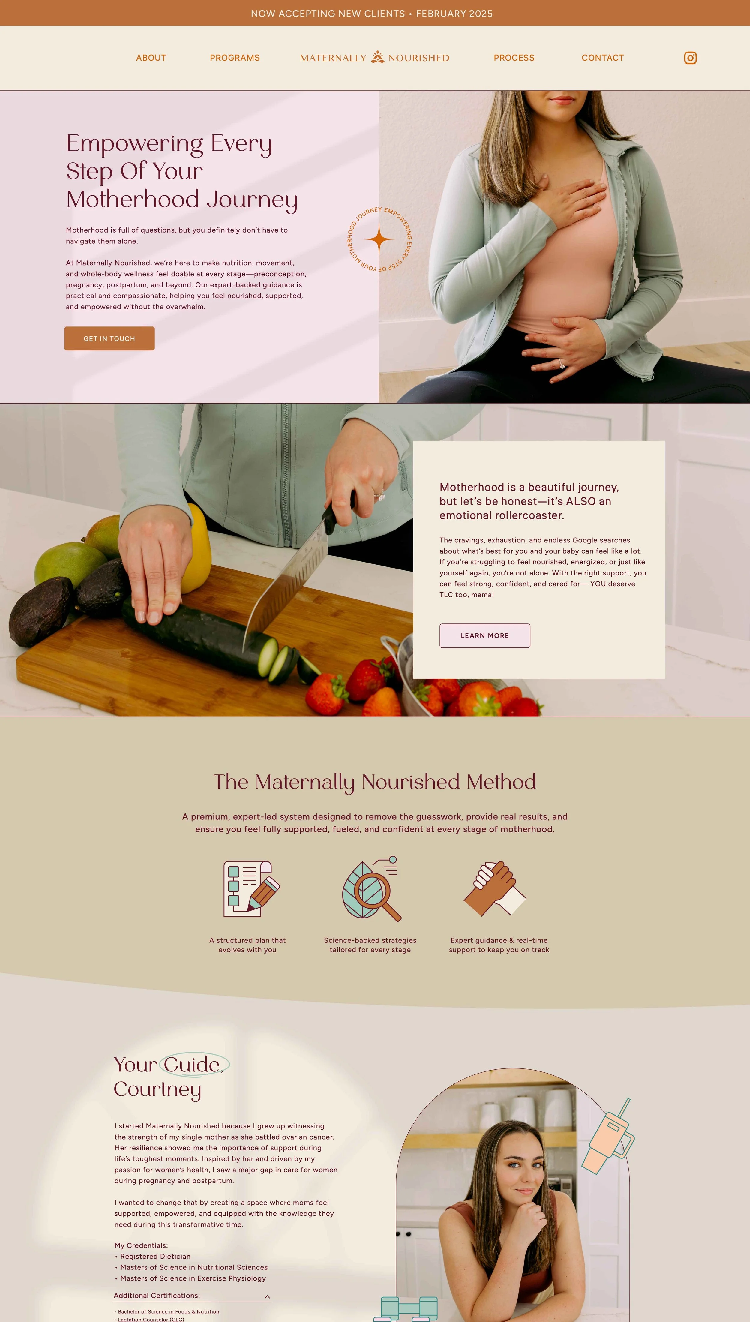
The Website
Website Design

Feels Like Home
Once we had finalized Courtney’s logo, we brought it to life online with a welcoming landing page website. Designed with joy and self care in mind, the site acts as an inviting space for new and expectant mothers to connect with Courtney’s expertise and feel fully supported in their unique journeys.
